New Site Typeface — Brix Sans
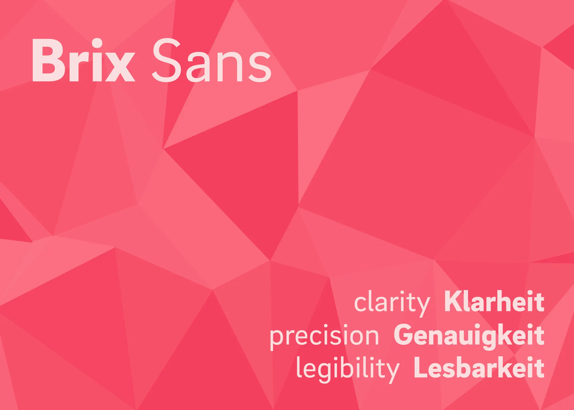
Table of Contents
Choosing the right typeface for a website or project is an inexact science that often seems wholly subjective or arbitrary. For me, it’s a mostly intuitive process that involves a lot of trial and error. But sometimes things just click.
That’s how I felt about choosing to re-typeset this site in Brix Sans, a fantastic sans-serif from the Berlin-based studio HvD Fonts. For many, HvD might be synonymous with Brandon Grotesque, that darling geometric sans which graced every single best-selling book cover, hip new eatery logo, design-forward product, and boutique website from about 2010 to 2015 (granted, I don’t see it as much anymore). But primary designer Hannes von Döhren consistently puts out some real gems that can easily win a featured spot in a designer’s typographic arsenal. (These fonts don’t break the bank either — licensing for single styles runs from about €15 to €35 for most typefaces, which is more affordable than many foundries.)
Brix Sans is one of my favorite typefaces, period. It’s been around since 2014, but I don’t see it in use much on the web, which doesn’t make sense to me because I think it reads far better on screens than many commonly used sans typefaces. (And it has a lot more character than the ubiquitous tech favorites Inter or “System UI”.) An exception is the HvD website itself, which uses Brix Sans as its primary typeface — which tells me something about its quality. If it’s the designer’s favorite, it’s definitely special.
HvD describes the typeface like this:
The concept was to create a pure, distinctive and timeless typeface for the digital age: a typographic tool “from designers for designers” with a maximum of clarity, precision, legibility and unique — some might say German — character. A simple, essential and fluid visual language at first glance, Brix Sans reveals countless subtle, handcrafted and vivid details that its designers call “heart and soul.”
Well, that’s a lovely description, and those are things that I strive for in my design work constantly. So it’s a perfect fit.
Self-Hosting Fonts
The other main reason I wanted to update the typeface(s) on this site (I’m also using JetBrains Mono for code syntax highlighting) was so that I could self-host font files. Previously, I had been using Adobe Typekit/Fonts and Google Fonts for this and a few other sites, mostly out of laziness. The immediate access you get to hundreds of professionally crafted fonts through Adobe works well when designing in Adobe applications like Illustrator and InDesign. And there are dozens of great, workhorse fonts available for free via Google Fonts. But when you try to use these companies’ own font services on the web (in the form of the embedded source links they provide), there are two major problems and one philosophical principle to consider.
The first problem is ethical: ceding control of any kind to massive corporations with terrible track records like Adobe and Google is a bad idea, even if they don’t directly breach privacy laws through their font services (although it appears, unsurprisingly, that Google in fact does breach European privacy laws with its fonts API). For me, it’s also about extracting as much of my design work as I can from an ecosystem that is built on harmful and monopolistic capitalist practices that ultimately redound to the power and gain of those same terrible corporations. It’s too easy to forget that digital fonts are software products made by people and studios, and the less we can rely on giant corporate middlemen to facilitate our use of them on the web, the better the design industry will be.
The second problem is performance: it’s just faster to load fonts on a site when you’re doing it yourself, and if you do it correctly, you can minimize or avoid entirely that dreaded FOIT/FOUT. I learned a lot about this from many of Zach Leatherman’s posts about developing loading strategies for self-hosted fonts. Most of these tactics are easy to implement and should be a baseline when using fonts from Google Fonts or any other source.
(As an aside, it’s hilarious to me that Google’s own embedded fonts API gets tagged as a “render-blocking resource” when you run a Google Lighthouse performance audit. In other words, Google’s method for providing fonts fails Google’s own performance test.)
And finally, there’s the philsophical principle: that graphic and web designers should just be in the practice of licensing fonts ourselves, whenever financially feasible and whenever a project allows it. As type designers and typographers constantly remind us, fonts are software products as well as artistic/service products, and designers should think of them as they would any other design tool or asset. Shelling out $100–$200 to license unique, professional-grade fonts for a project is a relatively small price to pay for the sense of ownership and control over a tool which Adobe and Google can never give.
Supporting small type foundries whenever you can also helps keep those designers independent and producing more cool fonts. I don’t know the exact economics for type designers in terms of direct licensing vs. licensing through something like Adobe Fonts, but I suspect it’s probably akin to selling an album directly on Bandcamp vs. making an album available for streaming on Spotify. Not only is the first option a more human and connected way to do it, the creators probably get a greater financial benefit when you buy to own. And we cut out the middleman.
Favorite Type Designers/Foundries
These are some of my favorite independent type designers/foundries to check out (and I just realized that all of these, with the exception of DJR, are based in Europe — I wonder what that says about my tastes 😅):