Mapping Meteorites
I’ve been playing around with the Mapbox GL mapping library, both as a way to practice my JavaScript and because maps are just dang cool. Building a complex map can be a little bit of a learning curve, but with the help of some examples, I was able to create a few that I think are pretty interesting.
The Dataset
Mapbox GL is a set of open-source libraries for creating client-side maps. It’s a fantastic alternative to Google Maps, both because it is incredibly comprehensive and customizable, and because, well, it’s not Google.
As I was exploring Mapbox, I started thinking about a potential dataset that would be fun to display. Many of the Mapbox examples use earthquake data, so I did some research on a few sites and pretty quickly found a perfect candidate that I thought would be super interesting—a set of observed meteorite landings (going back to the fifteenth century!) which is available on NASA’s Open Data Portal. This dataset includes a public API endpoint that allows the data to be fetched with a JavaScript data fetching method.
While it’s great that the data is just there and ready to use, I had to do a number of transformations to get it into the shape I wanted. Mapbox accepts a few different source types to use for mapping points, lines, or vectors, but a common, versatile (and very comprehensible) type is the GeoJSON format. I set up a function to map (pun not intended) the NASA data onto a GeoJSON object; an array of these objects assembled later then comprise the source for the map.
// Function to create a GeoJSON object from fetched data,
// where the data properties match those from the API endpoint
function createGeoJSONObj(data) {
  let obj = {
    type: "feature",
    geometry: {
      type: "Point",
      // GeoJSON is longitude first
      coordinates: [data.reclong, data.reclat],
    },
    // Properties can be any type and value
    properties: {
      title: data.name, // Name of the meteorite fall location
      type: data.recclass, // Meteorite classification
      year: data.year, // Year observed
      // Since the incoming meteorite mass value is a string, convert
      // it to a number with parseInt() — this is important because
      // I want to use meteorite mass as a major focus of the map styles
      mass: convertToNum(data.mass),
    },
  };
  return obj;
}
Meteorite Falls Heatmap
(Or check out the fullscreen version here)
Building the Map
It’s straightforward to get the Mapbox map itself up and running. Mapbox is all client-side, so you just add a div with an id of “map” or whatever else you want, and then initialize it with a script somewhere on your page (and don’t forget to add the CDN links to its script and css files). Voila!
mapboxgl.accessToken = YOUR_TOKEN;

const map = new mapboxgl.Map({
  container: "map", // Container ID
  style: "mapbox://styles/mapbox/dark-v11", // Map style URL — there are some cool defaults, or you can make your own!
  projection: "mercator", // How the map sizes and shapes are rendered — some interesting options here too
  center: [60, 25], // Starting position [lng, lat]
  zoom: 1, // Starting zoom,
  cooperativeGestures: true, // Adds zoom and movement hints
});
Adding the Source
Adding the source data is also pretty simple. The addSource method takes as arguments an id, here called “points”, and a source, here a GeoJSON collection. First, I’m fetching the NASA data, then using our createGeojsonObj function to create objects for each piece of data, then assembling an array we can use in the GeoJSON collection.
// The whole thing is wrapped in a self-invoking async function, which is called
// immediately — it's asynchronous since we have to await the fetch results
(async () => {
  const request = await fetch("https://data.nasa.gov/resource/gh4g-9sfh.json");
  const data = await request.json();

  const mapPoints = [];
  // Create new objects and add each one to the mapPoints array
  data.forEach((item) => mapPoints.push(createGeojsonObj(item)));

  map.addSource("points", {
    type: "geojson",
    data: {
      type: "FeatureCollection",
      features: mapPoints, // Use our array here
    },
  });
})();
Styling Layers
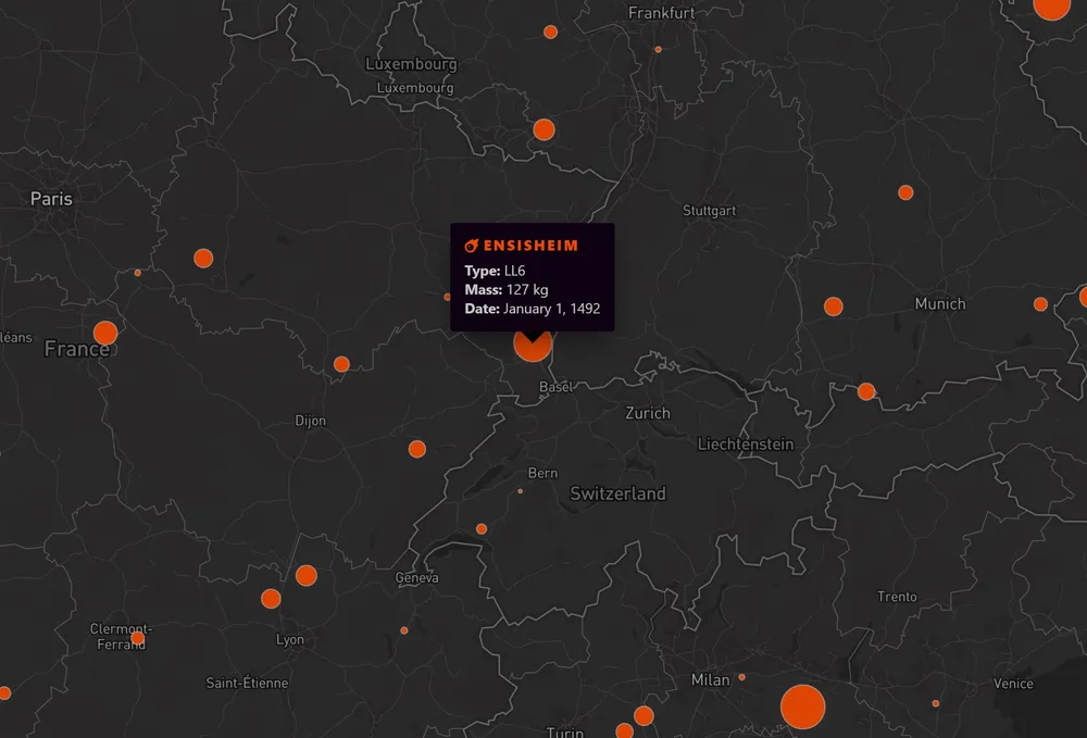
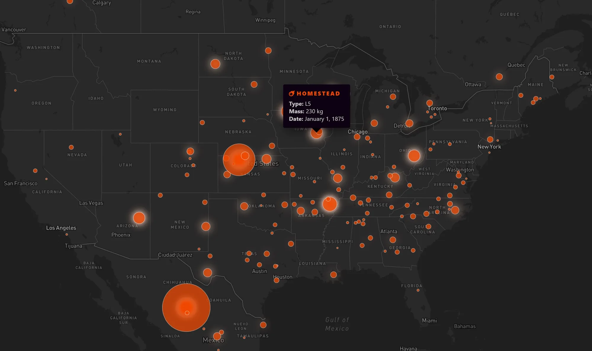
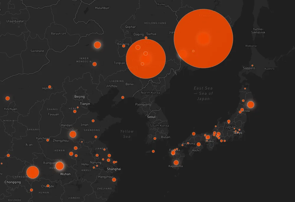
At this point, we have a source of about 1,000 meteorite coordinate points, each with associated metadata like title, mass, and year. Pretty cool! But nothing will show up on our map until we add a style layer (or many) with the addLayer method. This is where the real fun—and the real headaches—start. The simplest solution is to plot the points using circles or symbols, and having everything be a uniform size.
But I think that’s pretty boring! So I decided (with a lot of help from the Mapbox examples) to dynamically render the point sizes based on the mass of the meteorite—so heavier meteorites would show up as larger circles, while lighter meteorites would be smaller circles. After hours of trying to understand Mapbox’s interpolate expression, and a lot of trial and error, I finally got something that I’m (mostly) happy with.
Essentially, interpolate lets you take in a value from a source (here, the mass of the meteorite, which is why we had to change it to a number type earlier), and then use that as a kind of index to generate “stops” that the output will fluctuate between (it’s the same idea as gradient color stops, but with pure numbers—but Mapbox’s documentation is pretty confusing on how it works). I wanted the circle radius to change based on each meteorite’s mass, so I interpolated on the mass value. For an input of a mass of 10, the circle radius outputs to 1; for a mass of 100, 2; and so on, as you can see below.
map.addLayer({
  id: "meteorites-point", // Name of the layer
  type: "circle",
  source: "points", // Name of our source id which will be styled
  minzoom: 3, // Minimum map zoom level for the layer to render
  paint: {
    // The paint property determines everything about the styling
    // for the layer — the properties are different depending
    // on the layer type
    "circle-radius": [
      // Size the circle radius by mass level
      "interpolate",
      ["linear"], // Interpolation type
      ["get", "mass"], // Use the mass value from our dataset
      10, // "stop 1" input — meteorites with a mass of 10
      1, // "stop 1" output — circle radius of 1
      100, // "stop 2" input
      2, // "stop 2" output
      500, // etc.
      3,
      1000,
      5,
      10000,
      8,
      100000,
      15,
      500000,
      25,
      1000000,
      50,
      2000000,
      80,
      4000000,
      100,
      10000000,
      150,
    ],
    "circle-color": "#f04800",
    "circle-stroke-color": "#ffc8b0",
    "circle-stroke-width": 1,
    "circle-stroke-opacity": 0.6,
    "circle-opacity": ["interpolate", ["linear"], ["zoom"], 3, 0, 4, 0.9],
  },
});
A big part of the problem I had with this is that, as an American, I have a terrible sense of metric system values (I hate to admit it, but I had to triple check that the incoming meteorite mass values were indeed in grams 😅). There’s also just a massive range of mass values for these meteorites—and figuring out how to display that visually was part of the fun of building this map! It’s obviously very challenging to show the drastic difference between 10 and 10,000,000 on the same map, while retaining readability. So again, it was a lot of trial and error.
I also had to have a unit converter up constantly (because dumb American), but I really wanted to get a sense for what these meteorites actually weighed in relative terms. After all, grapsing details like this is part of the whole point of the map. So, with the help of weightofstuff.com, here’s my little conversion chart (and I really do want you to imagine these items hurling down at you from outer space at terminal velocity):
- 1 kg: Quart of milk
- 10 kg: Sledgehammer
- 50 kg: 60" flatscreen TV
- 100 kg: Giant panda
- 500 kg: Concert grand piano
- 1,000 kg: 2016 Chevy Spark
- 5,000 kg: Elephant
- 20,000 kg: Fire truck (yes, that iron meteorite in Sikhote-Alin is an absolute beast)
Heatmap Layer
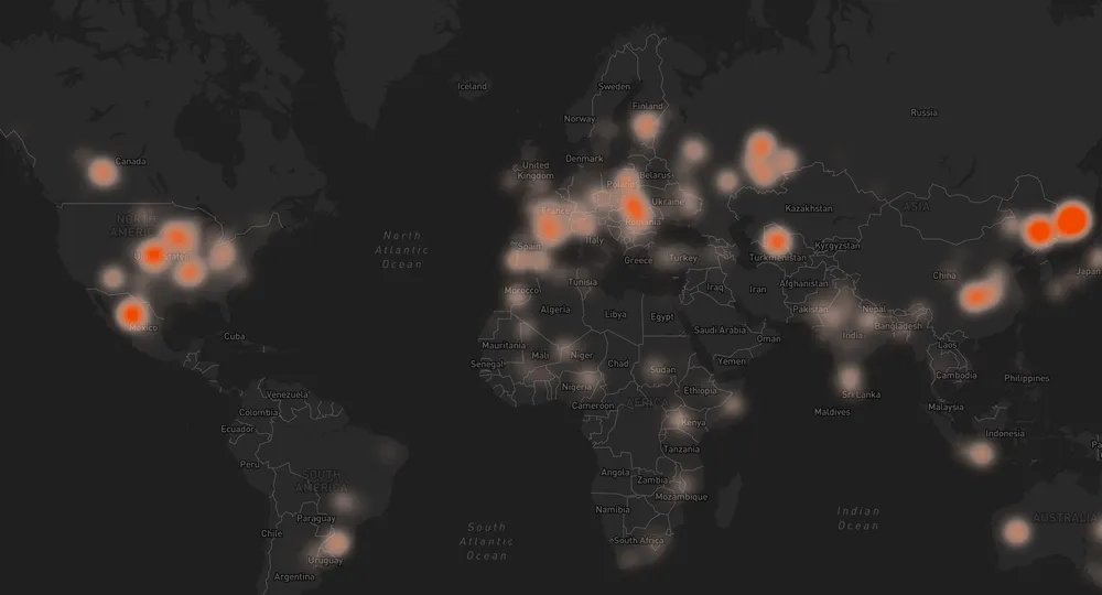
While the dynamic circle sizes were great, I wanted something a bit more, especially for the initial view of the entire earth at zoom level 0. At that view, the various sizes are too jumbled anyway to make visual sense of them. So I added an additional heatmap layer (I also could have gone with a cluster layer). I hadn’t considered a heatmap initially as a way to show this data, but its definition as a technique that “shows magnitude of a phenomenon as color in two dimensions” was exactly what I was looking for.
With another addLayer method, we can add a second map layer on top of the dynamically sized points. The interpolate expression for "heatmap-weight" works just as before, except here it is multiplied by a second interpolate on the "heatmap-intensity" property. Then, another interpolate handles the color gradient so that denser areas get dark/opaque colors, while less dense areas get lighter/transparent colors. Finally, a fourth interpolate handles a smooth opacity transition between this layer and the dynamically sized points on a closer zoom.
map.addLayer({
  id: "meteorites-heat",
  type: "heatmap",
  source: "points",
  maxzoom: 6,
  paint: {
    "heatmap-weight": [
      "interpolate",
      ["linear"],
      ["get", "mass"],
      10,
      0,
      500000,
      1,
      3000000,
      2,
      10000000,
      3,
      20000000,
      4,
    ],
    "heatmap-intensity": ["interpolate", ["linear"], ["zoom"], 0, 1, 5, 3],
    "heatmap-color": [
      "interpolate",
      ["linear"],
      ["heatmap-density"],
      0,
      "hsla(18, 100%, 97%, 0)",
      0.2,
      "hsla(18, 100%, 87%, 0.5)",
      0.4,
      "hsla(18, 100%, 77%, 0.7)",
      0.6,
      "hsla(18, 100%, 67%, 0.8)",
      0.8,
      "hsla(18, 100%, 57%, 0.9)",
      1,
      "hsla(18, 100%, 47%, 1)",
    ],
    // Transition from heatmap to circle layer by zoom level
    "heatmap-opacity": ["interpolate", ["linear"], ["zoom"], 4, 1, 6, 0],
  },
});
The combined effects of all of these styles renders a layer that shows us at a glance how much meteorite mass has fallen on a given area. That’s a lot of fire trucks.
Popups
Finally, we still have all of that metadata to display for each meteorite. So I used Mapbox’s Popup component to add custom info cards to each meteorite point when the view is showing the circle layer. (The code is too long and messy but you can check it out in the Codesandbox.)